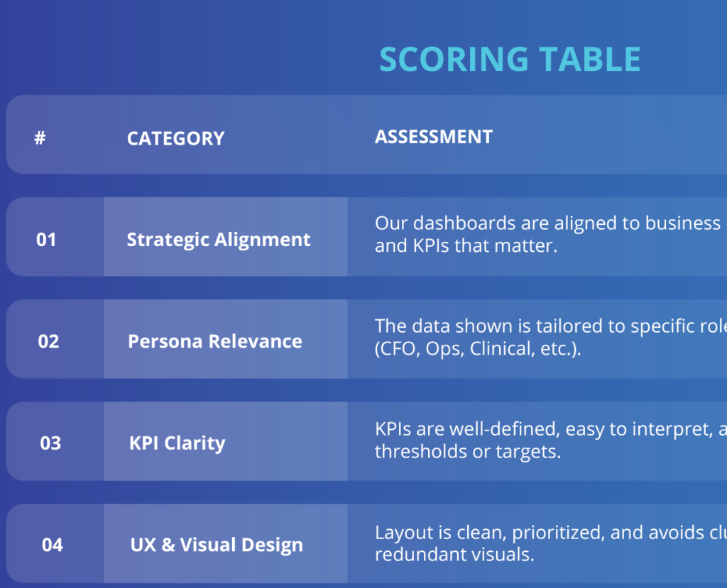

7 Costly Power BI Dashboard Mistakes That Erode Executive Trust
Introduction: Why Dashboard Mistakes Are So Expensive
A Power BI dashboard isn’t just a pretty report — it’s your executive team’s window into business performance. But when that window is cluttered, inconsistent, or slow, it erodes executive trust fast. Even the best data strategy falls apart if the delivery fails to inspire confidence.
Research from Harvard Business Review highlights that leaders increasingly expect data storytelling, not raw reports, and warns that poor dashboard adoption is one of the top reasons analytics investments underdeliver ROI (Harvard Business Review).
In this article, we’ll unpack the 7 most common Power BI dashboard mistakes that silently sabotage leadership trust — and how to fix each one.
Power BI Dashboard Mistake #1 – Overloading with Too Much Data
Why It’s a Problem
Executives are busy. A cluttered dashboard stuffed with charts, tables, and KPIs creates noise, not insight. When every metric shouts for attention, none of them get heard.
How to Fix It
– Use the 80/20 rule: highlight the 20% of metrics that drive 80% of decisions.
– Keep supporting details in drill-throughs and tooltips.
– Group metrics into logical sections (Revenue, Cost, Risk, CX).
Pro Tip: Use bookmarks and tabs for progressive disclosure so execs see what matters first, then drill deeper.
👉See how we simplify executive reporting in our Power BI Consulting practice — including the audit-first approach we use before touching a single visual.
Power BI Dashboard Mistake #2 – Misaligned KPIs With Business Goals
Why It’s a Problem
If KPIs don’t map to strategy, dashboards become vanity projects. Executives lose confidence when dashboards track activity instead of strategic outcomes.
How to Fix It
– Start from the business strategy: revenue growth, cost-to-serve, churn reduction.
– For every visual, ask: “Does this help move a strategic needle?”
– Replace vanity metrics (e.g., page views) with actionable metrics (e.g., customer acquisition cost).
Example: A financial services client swapped “total accounts” with Monthly Recurring Revenue (MRR) growth — instantly making the dashboard more relevant to CFO discussions. We documented the full KPI alignment process in our financial services case study — including the persona table that drove every design decision.
👉 Check our Power BI Consulting Services to realign dashboards to your business KPIs.
Power BI Dashboard Mistake #3 – Inconsistent or Confusing Visual Design
Why It’s a Problem
Executives won’t “learn” your dashboard. Poor UX = poor adoption. Conflicting colors, mismatched fonts, and unclear labeling make insights harder to trust.
How to Fix It
– Standardize color palette, fonts, and grid layouts.
– Use consistent KPI card placement across all pages.
– Keep titles and labels clear and concise.
Microsoft’s Power BI design guidelines provide best practices on color use, accessibility, and layout. Microsoft Learn
Pro Tip: Use tooltips and consistent legends to avoid confusion.
Power BI Dashboard Mistake #4 – Failing to Segment Data for Audiences
Why It’s a Problem
A one-size-fits-all dashboard rarely works. Operations, Finance, and the C-Suite need different levels of detail. Showing everyone the same dashboard leads to disengagement.
How to Fix It
– Use Row-Level Security (RLS) to control access.
– Create role-specific dashboards: COO (Ops KPIs), CFO (financial KPIs), CRO (customer KPIs).
– Tailor alerts and subscriptions by role.
Microsoft’s documentation on row-level security is a great reference for implementing this (Microsoft Learn).
👉 See how we built separate CFO and Director-level dashboards for a financial services client in this case study — the persona table on page 3 drove every RLS decision.
Power BI Dashboard Mistake #5 – Slow Performance and Load Times
Why It’s a Problem
Executives expect speed. A dashboard that takes 10+ seconds to load feels broken. Slow reports destroy credibility.
How to Fix It
– Optimize your data model (star schema > flat tables).
– Use aggregations for large datasets.
– Limit visuals per page (avoid >8 heavy visuals).
– Monitor refresh with the Power BI Service health dashboard.
Tools to Use:
– DAX Studio → identify performance bottlenecks (Dax Studio).
– Power BI Performance Analyzer → measure visual load times (Microsoft Learn).
Power BI Dashboard Mistake #6 – Lack of Narrative or Context
Why It’s a Problem
Data without a story is just noise. Executives want answers, not raw visuals. Dashboards that don’t provide narrative leave leaders asking “so what?”
How to Fix It
– Add commentary with dynamic text boxes.
– Frame visuals as questions answered (e.g., “Where are costs trending?”).
– Provide comparisons vs. target, forecast, or prior year.
HBR emphasizes that data storytelling drives executive engagement (https://hbr.org/2020/02/a-refresher-on-storytelling-for-business).
Example: A COO dashboard used dynamic cards to display: “Operating cost this month is 12% below forecast due to improved vendor contracts.” That narrative sealed leadership confidence. This storytelling-first approach is central to every engagement we run — you can see it applied across industries in our client Case Studies.
Power BI Dashboard Mistake #7 – No Clear CTA or Next Step
Why It’s a Problem
Insights without action are wasted. A dashboard that doesn’t point to “what should we do next?” fails to deliver value.
How to Fix It
– Add alerts, callouts, and action buttons linked to workflows.
– Define owners for each KPI (who acts when metrics go red).
– Integrate dashboards with Teams, Planner, or Power Automate for follow-ups.
👉 Need talent to run BI programs? Explore our IT Staffing & Talent Placement.
How to Fix These Mistakes in Real Life
Fixing dashboard mistakes doesn’t require starting from scratch. Begin with a dashboard audit:
– Assess gaps in clarity, alignment, performance, and adoption.
– Use Power BI Performance Analyzer or DAX Studio to identify bottlenecks.
– Conduct a 15-minute stakeholder feedback loop to validate which KPIs truly matter.
Gartner notes that dashboards fail primarily because they don’t connect to business outcomes (https://www.gartner.com/en/articles/why-most-analytics-dashboards-fail).
Not sure where to start? Our Power BI Precision Audit™ maps your current reporting environment and identifies your highest-ROI fixes in a single session.
Final Thoughts
Fixing these Power BI dashboard mistakes isn’t just about design — it’s about driving trust, credibility, and results. Your dashboard should be a decision-making tool, not just a reporting mechanism.
By applying these fixes, you’ll:
– Increase executive adoption and trust.
– Align analytics with strategy.
– Turn dashboards into action-driving platforms.
Call to Action
Want help auditing your dashboards?
✅ Get your FREE Dashboard Scorecard today.
✅ Book a free Power BI Precision Audit™ — we’ll map your reporting environment, identify gaps, and show you exactly what a decision-first approach changes for your leadership team.
FAQ
What are the most common Power BI dashboard mistakes?
The top mistakes include cluttered visuals, misaligned KPIs, inconsistent design, lack of segmentation, slow performance, missing narrative, and no clear CTA.
How do I make my Power BI dashboards faster?
Use DAX Studio, optimize your data model with star schema, use aggregations, and reduce visuals per page. See Microsoft’s performance guidance: Microsoft Learn.
How do I align dashboards with executive goals?
Start with strategic KPIs tied to outcomes. Every visual should answer: “Does this help move a strategic needle?”
Should dashboards be different for executives vs managers?
Yes. Use row-level security and role-specific views so each audience sees relevant KPIs.
How do I increase adoption of dashboards?
Simplify, add narrative, and integrate CTAs so executives act directly from dashboards. HBR stresses data storytelling as key for adoption.